Our Next Energy. Batteries that go further, explained for drivers and the grid.
Our Next Energy (ONE) builds energy storage for electric vehicles and the grid. Its Gemini™ dual-chemistry battery significantly extends an EV’s range, and its Aries™ series offers sustainable, durable and efficient storage, built on abundant materials and a strong U.S. supply chain.
Shaped the website’s structure and built its pages on the front end, coordinating content across photography, video and graphics. Beyond the site: the email marketing templates, internal and external presentation decks, and the in-house signage design system, so the brand held together on screen and in the building.
- Role
- Senior UX Designer
- Built With
- DatoCMS
- Worked With
- 2 UX Designers, 2 Design Producers, 2 PMs, a Graphic Designer, 2 Web Developers
- Year
- 2023
- online conversions
- +15%
- Series B the site helped present to investors
- $300M
A Site Built Around the Batteries
Battery chemistry is hard to explain. The structure starts with the question people care about, range, then introduces each battery by what it’s for, with its capacity and range right there: Aries for trucks, boats and more, Aries Grid for stationary storage, and Gemini for the longest trips.
Less of the Metals That Cost the Most
Part of the story is what ONE leaves out. The site makes it concrete: next to each chemistry, how much less of the scarce metals it needs.
Aries Grid
For the grid, the page has to work for a different reader: someone buying storage for a factory, a data center or a community. It leads with scale and reliability, then breaks Aries Grid down into its cells, packs and systems.
Beyond the Website
The same system carried into email templates, presentation decks for audiences inside and outside the company, and signage across ONE’s buildings, which became a design system of its own.
Signage for a Battery Factory
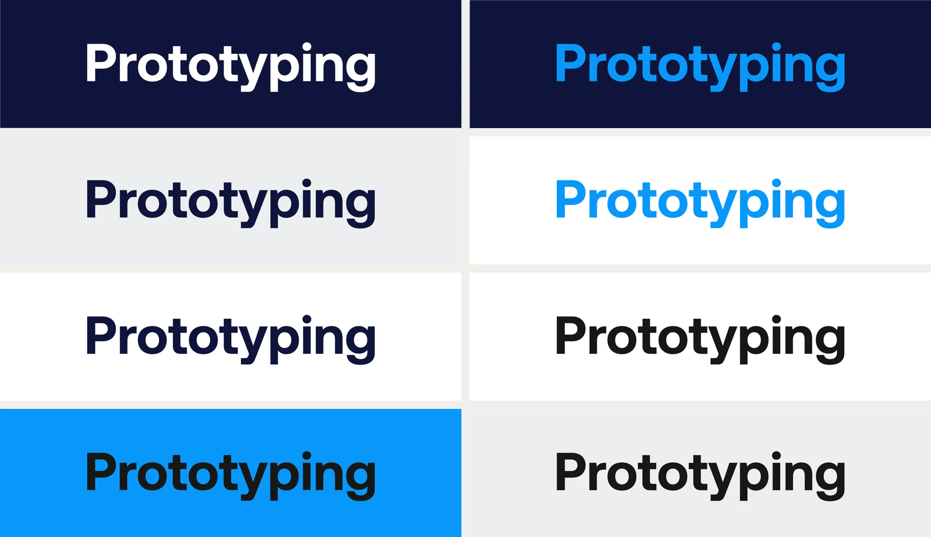
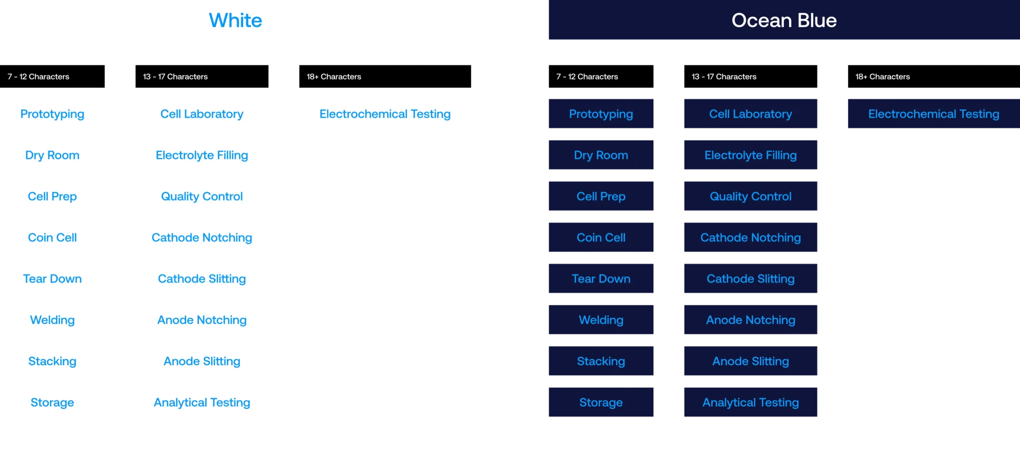
ONE’s buildings are labs and production lines, and every room needed a name people could read from down a corridor. The signage started as options: each brand color as a background, Aeonik in regular, medium and bold, and every pairing tested on the same word. Then the room names themselves, sorted by length, from Dry Room to Electrochemical Testing, so a sign’s width follows a rule instead of a guess.
Decisions
- Lead with range. The site opens on the one question every driver has, then gets technical. Engineers have to scroll a little further; everyone else stays.
- Built for the team to publish. Pages are built from DatoCMS content, so ONE’s marketing team can add products and news without a developer.
- One system, on screen and off. Owning the signage alongside the site meant one set of rules from the homepage to the factory floor.
Outcome
The website and CMS work lifted online conversions 15%. The site played a key role in ONE’s $300M Series B: the three products, how they were presented, and the data visualization behind them gave investors a clear picture of what ONE was building.
Three launches designed for ONE contributed to $20M in new investment.
In their words
“The product pages were clear and visually tasteful, and the data display let me look beyond the numbers and see a true comparison.”
An investor, on the product pages.